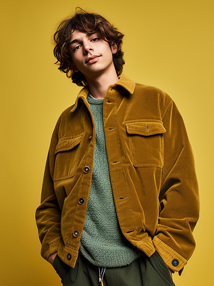
Every season, the fashion world gathers its collective imagination and translates it into colour. Spring/Summer 2026 is no exception. This season's palette is a vivid, emotionally charged collection of hues that speaks to a generation seeking both joy and depth. From the runways of Paris and Milan to the lookbooks of independent designers, the colour story of SS26 is one of the most compelling and cohesive we have seen in years, offering something meaningful for every wardrobe and every mood.
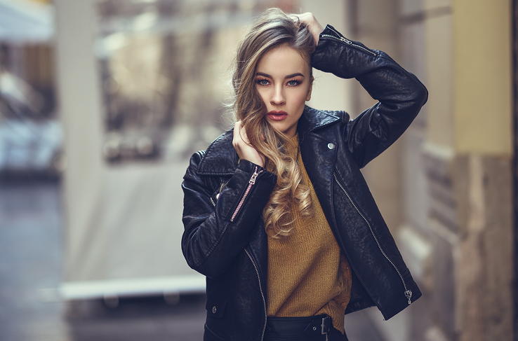
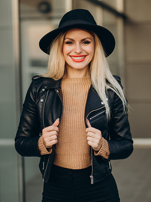
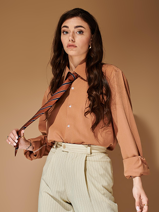
At the heart of the SS26 palette lies a family of warm, sun-drenched tones that feel simultaneously nostalgic and forward-looking. Terracotta, amber, and burnt sienna dominate the warmer end of the spectrum, evoking the feeling of golden afternoons and sun-baked landscapes. These earthy shades have been reimagined in lightweight linens, fluid silks, and open-weave knits, making them feel entirely appropriate for the warmer months ahead. Designers have embraced these tones not as a trend, but as a foundation — a grounding warmth upon which the rest of the season's story is built.
Contrasting beautifully with the warmth of the earth tones is a series of cool, aquatic shades that bring a sense of calm and clarity to the season. Seafoam green, pale aqua, and soft cerulean blue have appeared across collections in everything from tailored separates to flowing maxi dresses. These colours carry with them a sense of openness and possibility, as though the wearer is standing at the edge of the ocean with the horizon stretching endlessly before them. They pair effortlessly with white and cream, creating looks that feel clean, fresh, and deeply wearable.

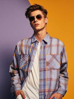
Perhaps the most unexpected element of the SS26 colour story is the bold emergence of vivid, saturated brights. Electric yellow, fuchsia pink, and cobalt blue have made a powerful statement this season, appearing in head-to-toe looks that demand attention and celebrate confidence. These are not colours for the faint-hearted, but they are colours for those who believe that dressing is a form of self-expression. Worn as a single statement piece or combined in daring colour-blocked combinations, these brights inject energy and optimism into the season's narrative.
Soft pastels also have a significant role to play in SS26, though they have been updated from the sugary sweetness of seasons past. This year's pastels carry a slightly muted, chalky quality that gives them a more sophisticated and grown-up feel. Dusty lilac, blush rose, and pale sage green appear in beautifully draped garments and delicate knitwear, offering a quieter, more introspective counterpoint to the season's brighter moments. These shades work particularly well in layered looks, where their subtlety allows for interesting tonal combinations without overwhelming the eye.
Neutral tones have also been thoughtfully reconsidered for SS26. Rather than the stark whites and beiges of previous seasons, designers have opted for warmer, more complex neutrals — oat, parchment, warm stone, and greige — that feel rich and considered rather than simply safe. These shades serve as the connective tissue of the season's palette, allowing the more expressive colours to shine while providing a sense of cohesion and balance across an entire wardrobe. They are the colours that make everything else work, and their importance should not be underestimated.
The colour story of SS26 is ultimately a story about emotional range and the freedom to express it. It is a palette that refuses to be pinned down to a single mood or message, instead offering a full spectrum of feeling — from the grounded warmth of terracotta to the electric joy of fuchsia, from the quiet contemplation of dusty lilac to the open optimism of aqua blue. This season, colour is not just decoration. It is communication, identity, and intention. Wear it boldly, wear it thoughtfully, and above all, wear it as an expression of who you are right now.